“Beauty cannot be judged objectively, for what one person finds beautiful or admirable may not appeal to another.”
Proverb
Can a font make you a better or more efficient coder? I don’t know how to quantify an answer to that question, at least not quickly or easily. I’m sure there are methods to measure such things, and there are some people that care about such things, but I’m not one of them. When I spend countless hours staring into the abyss of a text editor, I like to appease my right brain with aesthetically appealing visuals while my left brain is grokking the technical elements of my project. This post is the first of a series of posts about how I’ve customized my Visual Studio Code to be aesthetically pleasing and, hopefully, more productive.
VS Code is highly extensible and malleable, allowing users to customize their environment to their preferenced tastes. In this post, I’ll be discussing how I customized the text editor font parameters to suit my tastes.
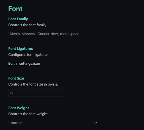
The VS Code text editor has four customizable font parameters. The font family, size, weight, and ligatures. These four parameters affect the text data displayed in the editor windows. Other text elements displayed by VS Code, such as in the Side Bar, Panel, are not affected by changes in these parameters.

Font Family
The first decision to make when customizing the text editor font is which font to use? By default, VS Code uses either Menlo, Monaco, Courier New, or monospace font. These default fonts are generally already available on Windows, macOS, and Linux as part of the OS. If you’re content with the default font, you can skip down to the next section on setting the font size and weight.
There are lots of fonts that make a visually appealing text editor font and an equal number of opinions on which one is best. Just Google “best font for text editor” and you’ll be overwhelmed with the number of recommendations for best text editor font. As you’d expect, there’s a lot of repetition and duplicates on the various lists. I liked this article from B.J. Keeton posted on elegantthemes.com, “10 Best Programming Fonts to Save you from Eyestrain.”
Most of the fonts in this article are also on many of the other best text font lists. I like B.J.’s recommendations because he has a nice concise list of great fonts for programmers, he provides information about each font and where to get them, and he has a short YouTube video reviewing each font.
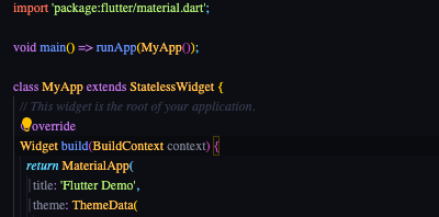
I selected Fira Code for my VS Code text editor font. It has a sharp, clean look, is easy on my eyes, and supports ligatures. I’ll discuss ligature support in VS Code after font family, size, and weight.
Once you’ve selected a font family, make sure the font is installed on your system. In my case, I needed to download Fira Code from fonts.google.com and add the font to my MacBook Pro. If you’re unfamiliar with how to install fonts from Google Fonts, check out this article from TechJunkie, “How To Download and Install Google Fonts.”
Once the font is installed, go into VS Code’s setting by clicking on the gear icon at the bottom of the Activity Bar or entering Ctrl+, on Windows or Linux, and ⌘+, on Mac. The User tab should be selected, click on Text Editor to fan open the text editor setting then click on Font. The four text editor font settings are now displayed. Click in the text edit field under Editor: Font Family and enter the font family name of the font you’ve selected.

Note: if the font family entered into the text edit field is misspelled or not available, VS Code won’t give an error message. It just uses a default font; in my case, it used a serif font.

Font Size and Weight
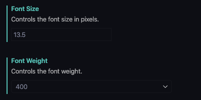
Next up are font size and weight. Select an appropriate font size and weight. The font size and weight settings are straightforward, enter the desired point size in pixels and a weight. Available font weights are normal, bold, or one of the nine font-weight values between 100 and 900, where 400 generally equates to normal and 700 to bold. A font size of 13.5 with a weight of 400 is a good baseline setting for most users. Fractional font sizes are allowed.

Ligatures
VS Code supports using ligatures if they are available in the font. If you’re not familiar with ligatures, ligatures are a single glyph that represents two or more characters. For example, in publishing, you’ll often see “ff” combined into a single “ff” glyph. In most programming languages, boolean and mathematical symbols typically written as a single character are written using multiple characters. For example, “greater-than-or-equal-to” is written as “>=” but is displayed as “≧” in a font that has an appropriate ligature glyph.
Fira Code does support ligatures, and I like the readability of ligatures in code. To configure VS Code to use ligatures, first, hover your cursor to the left of the Font Ligatures text in the Settings window until a gear icon appears. Click on the gear and select “Copy Setting as JSON” from the pop-up menu then click on “Edit in settings.json” under Font Ligatures. In the settings.json file, paste the copied ligature setting and set to “true.” Be sure to add a comma at the end-of-line or the end of the previous line, depending on where you placed the ligature setting.


That’s it! You’ve customized your VS Code text editor. BTW, if you change your mind for some reason, you can quickly revert your changes to the VS Code defaults. A vertical bar next to a configurable parameter in the Setting window indicates changed parameters from the default value. Hover your cursor to the left of the parameter you want to reset until the gear icon appears. Click on the gear and select “Reset Setting” from the pop-up menu, and the parameter reverts to its default setting.